Thursday, May 21, 2015

Corel Paintshop Pro X7 - Perspective Error Correction - Hurrah!

The perspective error gets me every time when I take photos for the blog.   My arms are too short (even with the kitchen step stool) and the fabric too long...  Today, I stumbled upon the perspective correction tool in Corel Paintshop Pro X7.   At last!   A solution!   So easy!  This is big!   You can see in the original photo below that the perfectly rectangular cardboard auditioning frame is narrower at the top and wider at the bottom of the photo.   Yep, classic perspective error...
Original photo complete with feet on kitchen step stool and perspective error. 
   I cropped the photo to get rid of the feet and positioned the 4 corners of the perspective correction tool's box..
Perspective correction tool being used.
I cropped the photo again, then admired the nice straight cardboard frame.  Success! 
Photo with corrections completed.

There are various suggestions out there for getting different vantages on your artwork.   For example, you can turn the artwork 90 degrees, view it from a distance, squint at it or look at it thru a camera lens.   Anybody have any other suggestions for "seeing" your artwork?   The auditioning frame can only be in one position at a time, so the camera gives me the ability to compare options too.  It's so much better to compare the options without the distortion.

Here are two different frames of a single piece of fabric being auditioned.  Because I'm collaging on these backgrounds, it becomes important to determine what I wish to be seen and what can be covered up.  I like the way the darker reddish-purple color helps frame the top photo the best.

Two auditions of the same piece of fabric using a cardboard frame as a view finder.
If you're grazing the Internet late at night and could use a chuckle, I offer up the girl geek band, "The Doubleclicks."  The "Hollywood Raptor" song is especially for those of you who also feel short in the arm when photographing your work...

Tuesday, May 19, 2015

Cardboard Auditioning Frame and "The Luminous Ground"

The life cycle plan for the museum exhibit fabrics is to turn them into tote bags to sell in the Sandy Spring Museum's store.   I've been dyeing larger pieces of fabric to make sure there is coordinating fabric available for handles later.   I attempted to work with two extra strips of fabric for handles for the first piece and it was a pain to pin all 3 pieces down, so I quickly learned to simplify!

Another lesson in simplification has taken place.  One goal of the grant is to start working bigger.  No longer will 4 pieces of random printer paper work to frame up a piece for auditioning!   What to do?   Thank goodness for our local Plaza Art store.   They will give you a huge cardboard folder if you purchase a bunch of their fabulous fancy paper sheets.  I treasure the paper *and* the cardboard folder.   Today I sacrificed a cardboard folder in order to make an auditioning frame.   Ahhh...so much easier to use this free tool to gauge the right place to print the next layer.   I'll mark the edges with an erasable fabric marking pen before moving the frame.   

Blue shibori background for a Civil War piece
After doing Elizabeth Barton's exercise, "The List of Important Features", to learn about my personal voice, I determined that I admire designs based on grid structures.   I decided to fold and dye a simple shibori pattern that I knew would give me a grid structure to add interest to a background.   So far, so good!    The next challenge will be to integrate the printed and TAP layers with the shibori background. 

Carol Soderlund introduced me to another Christopher Alexander book - "The Luminous Ground."  This is the fourth book in his "The Nature of Order" series and deals with color.   Christopher Alexander proposes eleven color properties that relate directly to the first book's fifteen properties of wholeness (beauty).   Happily, shibori automatically creates the property "echoes" where similar patterns are created thereby echoing each other and building centers.   The corresponding color property is called "Family of Colors."   Shibori involves resist techniques where parts of the fabric receive the maximum amount of dye, resisted areas keep out dye to remain their original color and some areas only get a bit of dye resulting in tints.    Hence, you get a range of colors.   Shibori dovetails nicely with the project goals.  

"Love what you do and do what you love.  Don't listen to anyone else who tells you not to do it.  You do what you want, what you love.  Imagination should be the center of your life."  - Ray Bradbury

Wednesday, May 6, 2015

"Neutral Territories" Dye Class with Carol Soderlund

Neutral Territories is all about finding the blacks, greys and browns hiding in various combinations of MX reactions dyes.   In Carol Soderlund's workshop at ProChemical & Dye, we were not handed individual recipes to dye neutral colors.   Instead, we were taught how to search systematically for neutral colors.   I was delighted to expanded my grasp of color through this process.   Toss in some discharge and thickened dye exercises and it was dye heaven!

Here is one sample card from my notebook - all of the colors are closely related..  The row on top was my favorite neutral grey/black.  Some seemingly black colors on the right hand column  when lightened are shown to have blue, purple and reddish shades.  The lightest values on the left hand column become more similar as the dye is diluted.

Below is the sample card that I dyed in my search for browns given the dyes used for the grant:   tangerine, strongest red and deep navy.  I found the range of browns very pleasing.  Carol's exercises taught me to evaluate the samples.   I know that I'd like to explore browns with slightly less red and more yellow hue based on the colors below.  Additionally, I'll be breaking down these browns into value gradations (like the picture above) to understand them better and increase my color vocabulary.

The workshop included time for individual projects.   I noticed a fellow student, Laura, had put notches in an old credit card and was scraping with thickened dyes.  I decided to follow suit using the nine closely related brown dyes from above.   Our marks looked totally different.   Here is the credit card and the two pieces created using my freebie tool:


I still had dye left, so I did some stamping with a 16oz plastic cup, a plastic salsa cup, a wooden thread spool and a plastic core from Mettler thread.   I was thinking about Christopher Alexander's Property of Wholeness "Levels of Scale" when I chose my circles in 4 sizes.   The dye was applied thickly in places, so it dripped when I hung it up out of the way.  I'm going to think of this as a two techniques bonus...stamping and dripping.


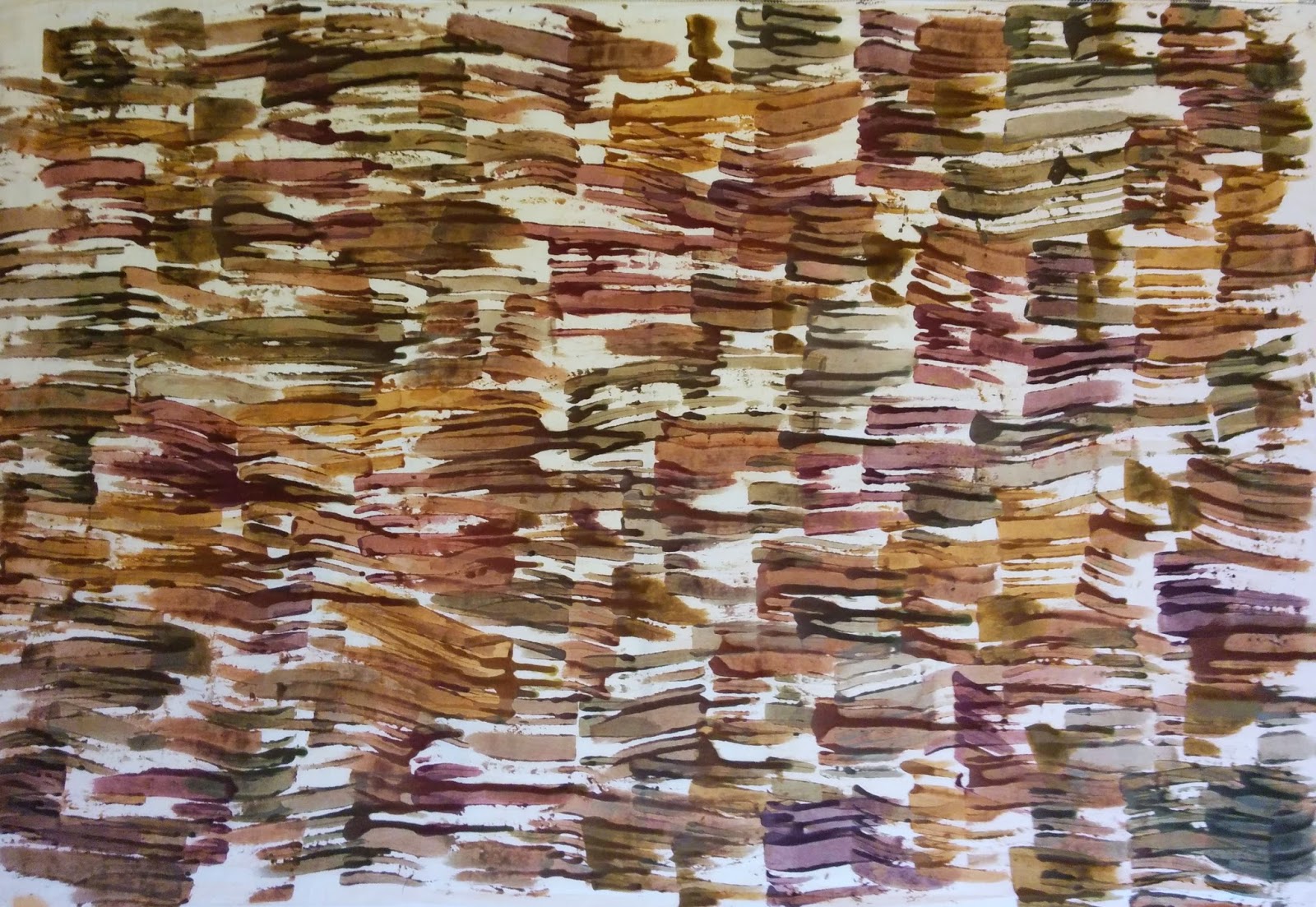
Messy plastic cups and dedicated brushes filled with a residue of thickened dye sat in front of me, but what to do with it?   I decided to add a bit of water and create dye washes to help clean up the brushes and cups.  Thickened dyes are *NOT* good for your drains!  It was a neat exercise in seeing how far the dye would go...  Once I had the stripes painted on the fabric, it occurred to me that I hadn't added soda ash anywhere along the line...ooops!   I scrunched up the fabric lengthwise and rolled it up like a cinnamon roll.  I stuffed it into a tight container (could't find a looser fit) and added some soda ash water.   I squirted some black dye on top of the fabric roll for good measure.   The error prompted me to create a piece more interesting than the original plan.   I love getting 2 visual layers for one dye process.


The last piece was created to use up the dregs of the dye washes.   I poured the remaining brown and black dyes into the bottom of a container and mopped it up with fabric that I had scrunched in my hand.  I rescrunched (it's a technical term despite what spell check is telling me...really...) the fabric in the container.   I squirted some leftover black dye on top and left it to batch.   Now I have a variety of related fabrics and very little wasted dye.
Scrunched fabric with colors breaking from a custom mixed black and browns.

Detail from the scrunched fabric above.

Dye companies such as ProChemical & Dye and Dharma Trading offer a few premixed browns, blacks and greys, but there are so many more available for the adventurous dyer!   Using the primary and secondary pure colors with neutrals blended from those dyes allow all of the colors used in a piece to harmonize.  Bright colors pop thanks to neutral colors.   The Neutral Territories workshop was inspiring.   It was my fourth color/dyeing class taken from Carol Soderlund.   She continues to offer new insights into color and dyeing.   I highly recommend her classes.   You'll find them well run, fun and chock full of information with excellent notes and samples to take home.


Saturday, April 25, 2015

Elizabeth Barton's "Find Your Style" Exercise Works!

The Potomac Fiber Arts Guild's members are encouraged to form small interest groups.   I'm lucky to belong to a group dedicated to studying design.  One of our members was inspired by a blog post from Elizabeth Barton -  "The List of Important Features."  Her article talks about the importance of personal style and how you can go about identifying your own.   Head on over to Elizabeth's blog to get her take on personal style...   

My design group decided to use Elizabeth's excellent style exercise, but with a twist.  A group member selects artwork that she's drawn to and presents it to the rest of the group.  The group feeds back what they see in the collection of artwork.   The presenter considers the group's opinion.  If the idiom "two heads are better than one" is true, then imagine how fabulous the seven heads are in our group!   I received the following feedback on my style preferences:
  • underlying grid
  • an organic feel
  • lots of orange/blue complements
  • layers of texture and pattern
  • representational imagery, but non-dominant
  • collage
  • strong use of line
This led me to create a grid structure for the background of my next grant piece.   An organic feel is incorporated by softening the edges of the grid.   I tried using some new screens, but the solid rectangles lacked interest.   I dug out some old screens that I'd used to run a screen printing event a few years ago.  I'd tucked them away to rescreen eventually.  The small amount of texture afforded by the randomly clogged screens was much more interesting when printed.   I can see that some orange and blue snuck into the composition.   Additional layers of dye, stitch, TAP paper and whatever else inspires will give the piece additional layers of texture and pattern, as well as, adding some representational imagery.
 Torn blue painter's tape is used on the printing screen to break up the straight lines.   
I am deliberately making my pieces larger than the 20"x33" size required because the fabric pieces will be made into tote bags to sell in the museum's store after the exhibit ends.   The extra fabric is required for straps.   It made me realize that I need to make a viewfinder tool that windows the 20"x 33" size, so that I print the next layer in an appropriate spot.   I'm off to raid my cardboard stash!

Draft Artist Bio + Blog Pages

I've finally been called out - I need to submit an artist bio...in under 200 words.   People like me can't sneeze in less than 200 words!   Fortunately, there is help out there on the Internet.   I used this article entitled "How to Write a Good & Effective Artist Biography" as my guide.   I answered their list of insightful questions and had the basis of my bio ready to write.   Many thanks to the Light Space & Time Online Art Gallery for offering up this useful tool.   I welcome any constructive critiques...  I now have a head shot to pair with it. Two more artist tools for my toolbox.


Diana Guenther was hooked early on fiber arts.  She was begging to embroider at age 5, took sewing lessons at age 8 and knitted the endless scarf thanks to Grandma at age 9.  
Fiber is part of her daily life.   She delights in the tactile satisfaction and accomplishment of making.   She especially loves the controlled chaos of large scale projects.   She thrived on felting with preschoolers, screen printing t-shirts with Girl Scouts and tie-dyeing with the swim team.   Art is about making and sharing making.
Diana turned her talents to winning art grants as the PTA’s cultural arts officer.   As the kids grew, her art-enabling included demonstrating and teaching spinning.   She loves to learn from other artists too.   She sought out workshops with leading artists including Jane Dunnewold, Elin Noble and Carol Soderlund.   Diana banded together with small groups of like-minded artists to explore design theory and surface design techniques.   Art provides intellectual challenge.

In 2014, she won an art grant from the Potomac Fiber Arts Guild to create an exhibit of surface design pieces based on the collections of the Sandy Spring Museum of Olney, MD.   Diana is currently designing fabrics with visual depth and rich historic content.

Writing the artist bio also nudged me to learn how to add pages.  Pages are used for static information that you always want to have available.   It wasn't hard.   I just had to go back to the layout and find the right gadget.   The upper right hand blog column now offers key information about this blog:   the artist biography and grant application.   The artist resume is coming soon...

Tuesday, April 14, 2015

Curriculum Vitae/Artist's Resume

One of the goals of the grant I received from the Potomac Fiber Arts Guild is developing the tools of a working artist.  The "Exhibit Summary Form" that I'm filling out for the Sandy Spring Museum requires a curriculum vitae.  It's time to create that tool...

I've written resumes before, but never a curriculum vitae.   I wondered how they differed.   There's a wonderful article entitled "Curricula Vitae (CVs) versus Resumes" from the University of N.C. at Chapel Hill's Writing Center that cleared the issue up for me quickly.  Resumes cover education and work experience.   I have none.   A curriculum vitae covers more of your life experience.  I do have fiber related volunteer work, workshops taken, classes taught, grants won, guild memberships and study groups in my background.  Clearly, a C.V. is the way to go! 

What a relief to find this article:  "How to Write an Artist's CV When You Don't Have Much (Or Any!) Professional Experience."   Thanks to thepracticalartworld.com  for shortening my learning curve.  I've created a blog page for my new C.V. and linked it to the top right hand column of the blog.  Done! 

Civil War Artifacts + Exhibit Title

Like many folks living in the Washington, DC metro area, I wasn't born here.   I know the broad strokes of American history, but discovering artifacts that highlight local history bring Sandy Spring alive for me.   At times the Quaker culture of Sandy Spring was at odds with much of the nation. This makes Sandy Spring a pretty interesting place. I was looking thru the archives for photos of Civil War soldiers last week and having little luck...until I thought it through.   Oh yeah!   Quakers are pacifists.   The absence of material was telling in this case.  Nevertheless, a few artifacts from the Civil War found their way into the Sandy Spring Museum collection.
Sandy Spring Museum Collection - Civil War Button - Maryland Officer's Uniform Button
A quick trip to www.relicman.com found a photo and description of the button above. 
 "Button depicts state seal of Maryland, a shield with a fisherman, farmer, and eagle.  Manufactured before the war, intended for officers of Maryland militia units, who generally sided with the South but served both sides.  Backmark: "CANFIELD. BRO & CO. / BALTIMORE." dm between rings of dots, Scovill produced ca 1860"

I found it interesting that Civil War button and belt buckles are described on-line as dug versus non-dug.   The button above looks non-dug, but the belt buckle story infers that the buckle was dug up on a farm.   You learn something new every day...
Sandy Spring Museum Collection - Civil War Belt Buckle from a Union Soldier - Found on Hutton Farm August 1963
One of my current tasks is to refine my ideas for the exhibit.  I need an exhibit title, theme and 150 word statement for marketing purpose that sums up why you should come see my work.   The timeline concept that I've been working on has problems:   
  • a timeline is not an inspired, zippy presentation
  • many of the artifacts are not currently dated
  • the artifacts are not evenly distributed thru time (older = scarcer)
I was planning to start with the Native American artifacts (oldest man made items in the collection) and work my way up to recent times.   Now I am thinking that approach would not take advantage of the best the collections have to offer.   

What have I learned about the artifact collections?   The museum started collecting in 1981.  Items were frequently donated from estates.   So, it makes sense that a lot of artifacts donated were from the first half of the twentieth century.   These later artifacts tended to have more information associated with them.   Live and learn!   I wasn't able to elicit information about the character of the archives when I started the project, but I'll be sure to ask probing questions the next time I approach a collection.      
 
Reviewing the artifacts was like Cracker Jacks - "a prize in every box!".   Items are stored by accession date (when it was entered into the collection), so boxes are typically filled with random items.   I loved slotting each artifact into it's historical context.   Next, I'm contrasting calling cards versus texting and button hooks versus Velcro to consider how life has changed.   Unsafe tin dishes are outdated along with mercury-laden blood pressure cuffs.   Some of the artifacts pointed to bigger stories.   The bank letter to the local Grange stating that they would not continue to automatically invest the Granges' money in a failing Florida railroad had me scrounging for the dates of the Great Depression.  Score!   I loved the stories big and small.   Each vignette helps to evoke Sandy Spring's past as it evolves over time.   I want to convey the excitement of discovering Sandy Spring one artifact at a time.

My first working title was "The A.H.A. Moment:   Artifacts as Historical Ambassadors."  It wasn't universally embraced by the museum staff, but I'm told that I'm moving in the right direction.  Perhaps "Discovery:  Sandy Spring" would be more concise, if not very descriptive?  How about "Sandy Spring:  Going with the Flow and Bucking the Tide" superimposed on a tasteful chamber pot?   O.K., that was silly, but I did find a chamber pot in the collections.   You may be relieved to know that the museum director and marketing guy at the museum are prepared to step in and help name this exhibit.   In the meantime, I'm leaning towards "Dyeing to Tell a Story" as it references creating the unique one of a kind surface designed fabrics and the story telling I plan to do with the museum's objects, photos and documents.  Wish me luck in this next phase of exhibit design.   ...and place catchy title suggestions in the comments...   Thanks!