Tuesday, April 14, 2015

Curriculum Vitae/Artist's Resume

One of the goals of the grant I received from the Potomac Fiber Arts Guild is developing the tools of a working artist.  The "Exhibit Summary Form" that I'm filling out for the Sandy Spring Museum requires a curriculum vitae.  It's time to create that tool...

I've written resumes before, but never a curriculum vitae.   I wondered how they differed.   There's a wonderful article entitled "Curricula Vitae (CVs) versus Resumes" from the University of N.C. at Chapel Hill's Writing Center that cleared the issue up for me quickly.  Resumes cover education and work experience.   I have none.   A curriculum vitae covers more of your life experience.  I do have fiber related volunteer work, workshops taken, classes taught, grants won, guild memberships and study groups in my background.  Clearly, a C.V. is the way to go! 

What a relief to find this article:  "How to Write an Artist's CV When You Don't Have Much (Or Any!) Professional Experience."   Thanks to thepracticalartworld.com  for shortening my learning curve.  I've created a blog page for my new C.V. and linked it to the top right hand column of the blog.  Done! 

Civil War Artifacts + Exhibit Title

Like many folks living in the Washington, DC metro area, I wasn't born here.   I know the broad strokes of American history, but discovering artifacts that highlight local history bring Sandy Spring alive for me.   At times the Quaker culture of Sandy Spring was at odds with much of the nation. This makes Sandy Spring a pretty interesting place. I was looking thru the archives for photos of Civil War soldiers last week and having little luck...until I thought it through.   Oh yeah!   Quakers are pacifists.   The absence of material was telling in this case.  Nevertheless, a few artifacts from the Civil War found their way into the Sandy Spring Museum collection.
Sandy Spring Museum Collection - Civil War Button - Maryland Officer's Uniform Button
A quick trip to www.relicman.com found a photo and description of the button above. 
 "Button depicts state seal of Maryland, a shield with a fisherman, farmer, and eagle.  Manufactured before the war, intended for officers of Maryland militia units, who generally sided with the South but served both sides.  Backmark: "CANFIELD. BRO & CO. / BALTIMORE." dm between rings of dots, Scovill produced ca 1860"

I found it interesting that Civil War button and belt buckles are described on-line as dug versus non-dug.   The button above looks non-dug, but the belt buckle story infers that the buckle was dug up on a farm.   You learn something new every day...
Sandy Spring Museum Collection - Civil War Belt Buckle from a Union Soldier - Found on Hutton Farm August 1963
One of my current tasks is to refine my ideas for the exhibit.  I need an exhibit title, theme and 150 word statement for marketing purpose that sums up why you should come see my work.   The timeline concept that I've been working on has problems:   
  • a timeline is not an inspired, zippy presentation
  • many of the artifacts are not currently dated
  • the artifacts are not evenly distributed thru time (older = scarcer)
I was planning to start with the Native American artifacts (oldest man made items in the collection) and work my way up to recent times.   Now I am thinking that approach would not take advantage of the best the collections have to offer.   

What have I learned about the artifact collections?   The museum started collecting in 1981.  Items were frequently donated from estates.   So, it makes sense that a lot of artifacts donated were from the first half of the twentieth century.   These later artifacts tended to have more information associated with them.   Live and learn!   I wasn't able to elicit information about the character of the archives when I started the project, but I'll be sure to ask probing questions the next time I approach a collection.      
 
Reviewing the artifacts was like Cracker Jacks - "a prize in every box!".   Items are stored by accession date (when it was entered into the collection), so boxes are typically filled with random items.   I loved slotting each artifact into it's historical context.   Next, I'm contrasting calling cards versus texting and button hooks versus Velcro to consider how life has changed.   Unsafe tin dishes are outdated along with mercury-laden blood pressure cuffs.   Some of the artifacts pointed to bigger stories.   The bank letter to the local Grange stating that they would not continue to automatically invest the Granges' money in a failing Florida railroad had me scrounging for the dates of the Great Depression.  Score!   I loved the stories big and small.   Each vignette helps to evoke Sandy Spring's past as it evolves over time.   I want to convey the excitement of discovering Sandy Spring one artifact at a time.

My first working title was "The A.H.A. Moment:   Artifacts as Historical Ambassadors."  It wasn't universally embraced by the museum staff, but I'm told that I'm moving in the right direction.  Perhaps "Discovery:  Sandy Spring" would be more concise, if not very descriptive?  How about "Sandy Spring:  Going with the Flow and Bucking the Tide" superimposed on a tasteful chamber pot?   O.K., that was silly, but I did find a chamber pot in the collections.   You may be relieved to know that the museum director and marketing guy at the museum are prepared to step in and help name this exhibit.   In the meantime, I'm leaning towards "Dyeing to Tell a Story" as it references creating the unique one of a kind surface designed fabrics and the story telling I plan to do with the museum's objects, photos and documents.  Wish me luck in this next phase of exhibit design.   ...and place catchy title suggestions in the comments...   Thanks!

Sunday, April 12, 2015

Research Upgrade + The Home Improvement Society

Sandy Spring Museum is on their third archivist since I won the grant in May 2014.  The turnover has slowed down my researching.  When the latest archivist arrived, I was off tending another ring in my circus.   That's life...   The new archivist brings experience from the Textile Museum in Washington, DC, so I'm really looking forward to her input.

I met with the museum staff recently about moving forward with the research and starting the exhibit planning phase.   They've helped me regroup.  I am grateful for their guidance.   Previously, I was looking thru individual boxes of artifacts starting from those earliest accessioned into the collections (1981).   It's been a slow way to work, yet a quarter of the way thru it's given me a good feel for the archive collection.  The archivist has committed to pulling documents and photographs from e-mailed requests now that I've got specific fabric pieces that I'm designing.   I have finally narrowed my focus beyond a general timeline.   This is great news!


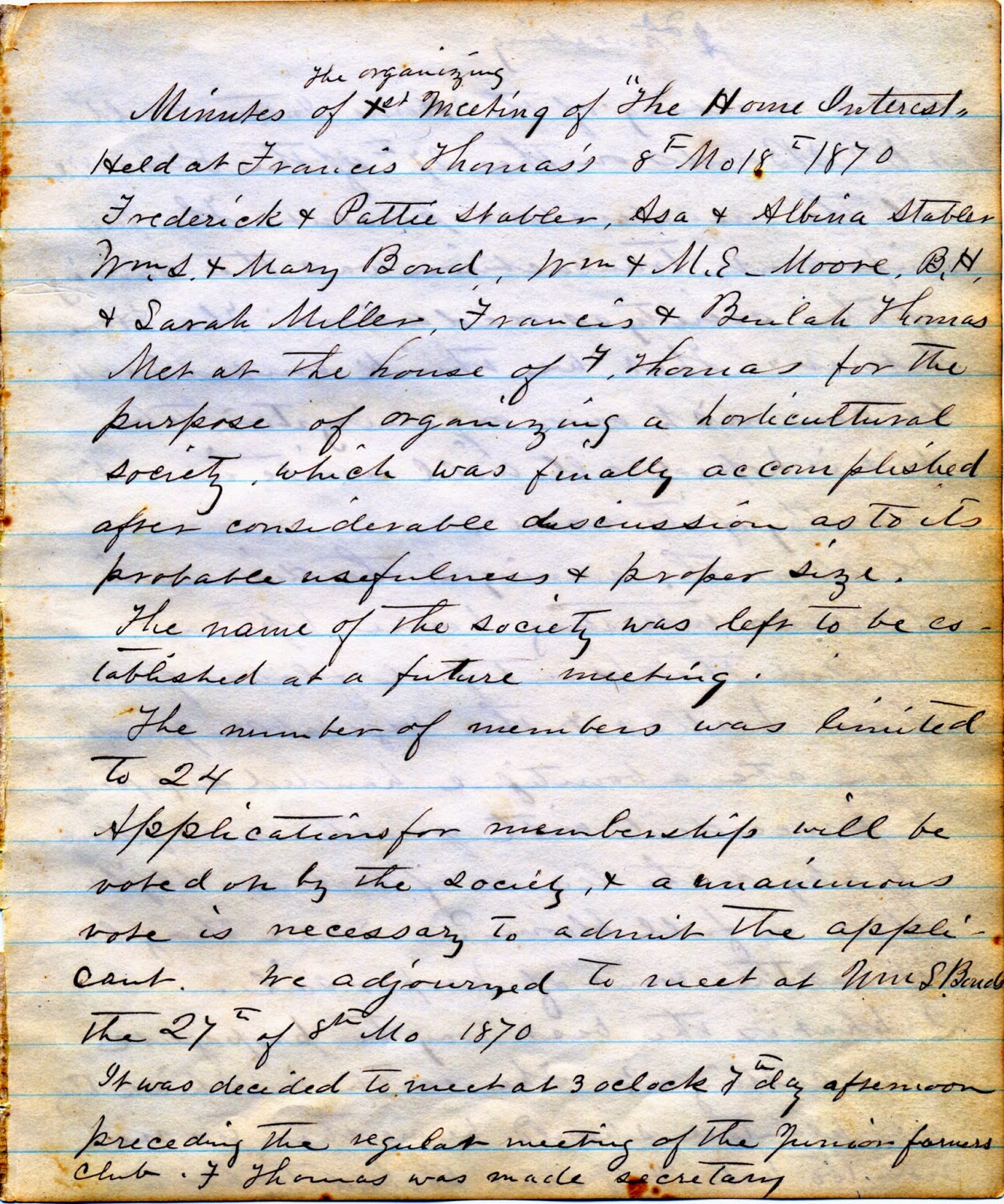
At the end of March, I sent in my first request list.   I'd found a photocopy of the Home Improvement Society showing women in old fashioned garb sitting in a room with a few sewing machines.   It intrigued me as a sewer.  I also wondered if this was part of the early organizing that led to the Women's Rights Movement.   Bingo!   I was provided with several newspaper articles and photos that I'd requested based on the collection catalogs.   In addition, the new archivist presented me with a vertical file of materials collected about the society.  On top of that, I received a box including all of the early minutes from the society.   Wow!   I suspect that the society's notes would be the basis of a very interesting exhibit.   I was able to hold the first notebook of minutes from 1870 in my white gloved hands.   It was an honor to look into that time capsule.  In terms of surface design, the handwritten pages were fabulous.

It was delightful to discover that the society is still meeting today.  The archivist was recently invited to attend the next meeting of the society.   What an amazing coincidence...  I was disconcerted to find that the Home Improvement society was actually organized by six married couples with an interest in horticulture in 1870.  This clashed with the notes on the Mutual Improvement Society being founded in 1857.  What about the photo above that references the Women's Association?   The newspaper articles indicated that the Mutual Improvement Society was the oldest women's organization in America.  Are we talking about two or three different groups?   I've found a number of names that overlap.  It was all tucked together in one vertical file.   Hmmm...I guess history isn't always clean cut.  

Either way, it was fascinating that the Quaker model was responsible for the ability of the local women to organize.   It wasn't seemly for women in the 1800's to hold office.   A woman couldn't be a president or a treasurer.   However, Quaker meetings held individuals as equal in status with a single clerk voted on to guide the meeting.  This allowed Sandy Spring's women to be in the forefront of social progress. 
 

Tuesday, April 7, 2015

Procrastination Station - The Dreaded Draft Post Blogging Build Up

Does anyone else live in Procrastination Station?   The rest of my life got busy and I let ugly "draft post build-up" happen.  Excuses were along these lines:
  • Sure, I can do the final edit on that post later...  
  • Oh, that post just needs a few more photos...  
  • Uh oh - I've leapfrogged this post and already talked about some of the material...
However, I'm not going to let it bug me or get my goat...
Sandy Spring Museum Artifact - Beaded Headband - c. 1915-1919 - Part of a Camp Fire Girl Costume
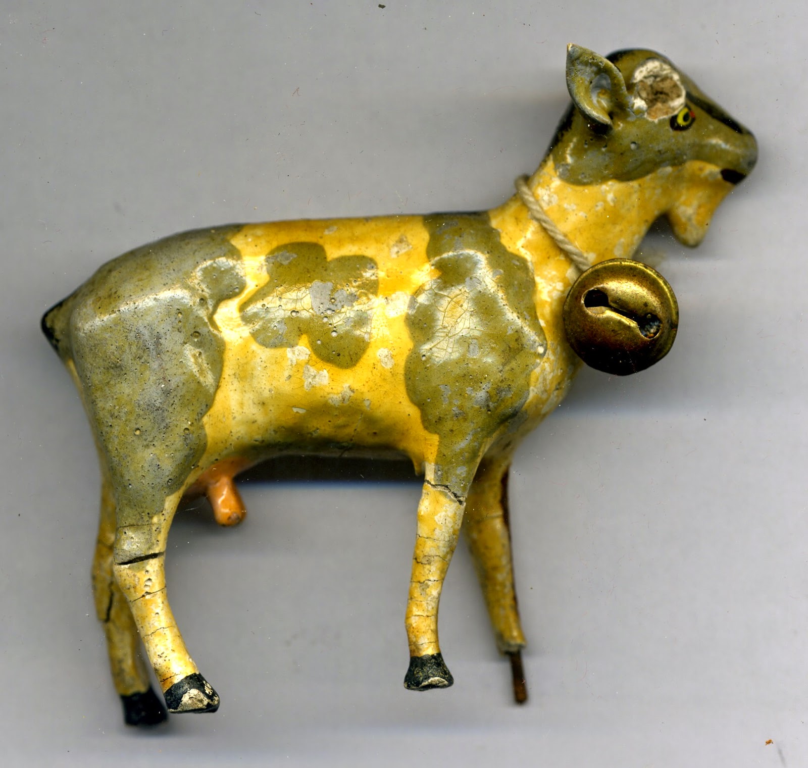
Sandy Spring Museum Artifact - Plaster Goat - undated - Part of a Nine Piece Farm Animal Set 

Instead, I finished up the promising posts in March and cut the lame ones loose.  I've watched the Blogger stats.  Naturally, you get fewer hits when there's nothing new to see. My new blogging goal will be better pacing:-)   

Monday, April 6, 2015

Diane Franklin's Book "Dyeing Alchemy" + Dye Calculator

If you use Procion MX dyes or want to learn how, then I have a treat for you.   Check out Diane Franklin's self published book "Dyeing Alchemy - A Primer About Procion MX Dyeing."   I admit to paging thru it shamelessly first for the artwork.   Diane excels at Shibori, but has experience in a wide array of dyeing techniques.   She's shared the work of other fiber artists too which keeps you flipping pages.


 I am impress at how thoroughly she covered the topic of Procion MX dyes. You will learn about:

  • the history of Procion MX dyes 
  • how the dyes work chemically
  • the 14 pure dye colors (great comparison chart for purchasing at ProChemical & Dye, Dharma Trading and Jacquard)
  • color theory/mixing dye colors
  • immersion dyeing with powders versus stocks
  • hue gradations and value gradations
  • pyramid dyeing (creating related fabrics from 2 or 3 dyes)
  • dyeing safely
  • supplies and equipment
  • recording your dyeing efforts
  • setting up a dye work space
  • planning an efficient dye day
  • going beyond the basics (think snow dye, thickened dye, painting with unfixed dyes, fabric manipulations, overdyeing, thread dyeing, and more)
  • dye suppliers
  • recommendations for books, DVDs and workshops
All of this information is a valuable resource for me and a real bargain at under $18.  However, what really sold the book for me was the dye calculator.   I'm working to improve my dyeing process.  I want repeatable results.   However, dyeing some days looks like the dreaded word problem...   
If Diana is dyeing a piece of cotton fabric that weighs 1.62 gram and she wants 4% depth of shade using a 5% dye stock, then how much urea, soda ash, salt and dye does she need?   
Some days this feels like a lot of math...   I have the formulas.   I know how to calculate everything (mumble, mumble...if I get out my notes and think about it...)   The joy of plugging in a few numbers and having the answers magically appear is pretty appealing!

I had the pleasure of meeting Diane at a dyeing workshop.   She advertised her dye calculator as a time saving tool that would allow me to frugally use just the right amount of chemicals - urea, soda ash, salt, dye - to get the color I wanted.  Save *time* AND *money*?   I haven't been disappointed.   Many thanks to Diane Franklin for putting out a great tool for fiber artists.   

Monday, March 30, 2015

Microwave a Hot Water Bath for Cold Day Dyeing

What would we do without friends?   Kay was describing how she proofed bread on chilly days by microwaving a cup of water, then letting that frozen dough sit in the the steamy microwave with the hot water.   In an hour, reheat the water and return the dough for further raising.  Smart...   So, today I heated a deep dish pie pan half filled with water in the microwave.   I set the container of fabric being dyed into the middle of the pie pan and shut the door.   An hour later, I reheated the water.  So easy!  After two hours I washed out the fabric.


Previously, I would put smaller dye jobs in the niche that houses my husband's computer CPU.  It stays consistently warm there.   Unfortunately, he took a dim view of my Ziploc baggies of fabrics and dye near the electronics.   A strategy for larger items has been a heating pad underneath and a box above to catch warmth.  I'm always afraid that I'll forget to turn it off...

I finished printing a piece of fabric today and was determined to fit it into the microwave too.   I spritzed it with a fine mist of water as most of the layers of dye had dried, rolled it in a plastic garbage bag to keep the layers of fabric separated from each other and folded the roll in thirds to fit into a plastic steamer basket.   The steamer basket sits up on legs which allowed me to suspend it over the hot water in the pie pan.   I plan to leave it in the microwave overnight.  I'm looking forward to the washout as this is supposed to be a light background layer.   I used a weak dye solution in the print paste, so the resulting piece should be more of a textured background.


I'm looking forward to the warmer weather, so that I can batch fabrics outside under black plastic.  I have two teenaged drivers, so no more batching in the back of the old car.   It's gone too often!  

What are your favorite strategies for cold weather MX reaction dyeing?

Sunday, March 29, 2015

Discharging with a Stencil + The Life of a Project

Look at this wonderful wooden French curve from the Sandy Spring Museum collection.  It was my top choice of shape to represent Christopher Alexander's concept of positive space.
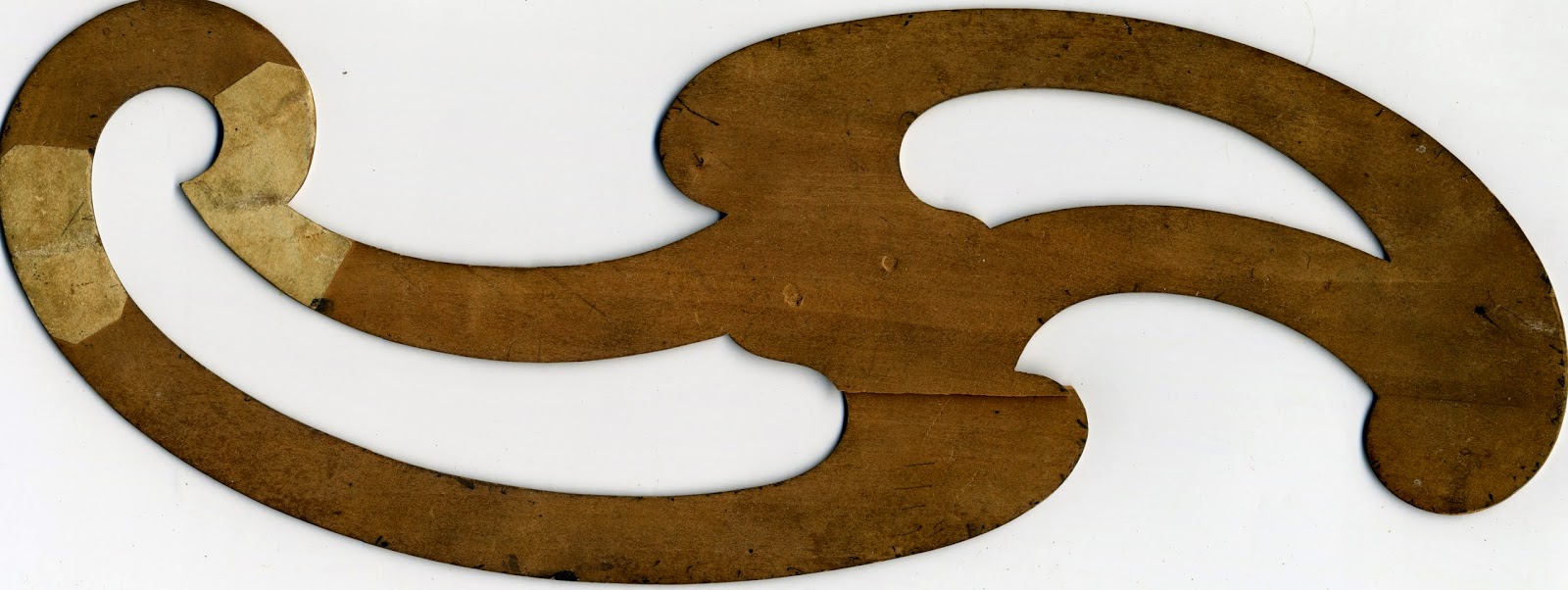
Wooden Template/French curve - Object ID 1990 0024 0022

I plan to use it as a large scale motif in the background of the fabric design enlarging the motif from 9.5" to 14" to better fit my fabric dimensions.   I'm envisioning 4 motifs placed as shown below.  This arrangement creates new shapes.   Each motif is a "center" in Christopher Alexander's terminology, but the grouping of the motifs builds additional centers which reference each other.
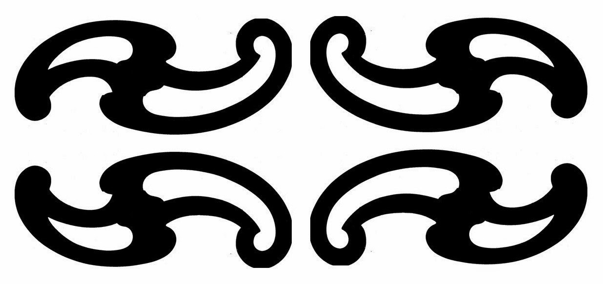
French curve motif mirrored, grouped and flipped.
I'm using Silhouette brand matte adhesive vinyl cut by a Silhouette Cameo to create the stencil.  The Silhouette software allowed me to enlarge the motif from it's original 9.5" wide to 14" wide to better fit my standard fabric size for the grant (18.5"x30").    It's a large, awkward stencil using the thin vinyl, so it's been adhered to my kitchen wall in between usages for fear of it sticking to itself.   In retrospect, a firmer stencil material would have been a better choice for this large motif.   I adhered it 4 times to fabric in my testing without issues.   It's still tacky enough to use again.   The thin diameter of the vinyl makes it easy to print.  I'll keep looking for a better, cheaper stencil material, but this work pretty well.  
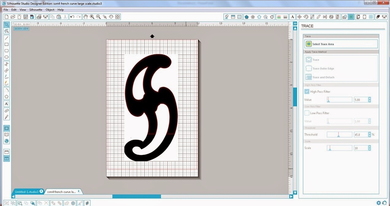
Screen shot of the Silhouette software.   The original attempt to trace the motif on a 12"x 18" background.


I couldn't get the Silhouette software to trace the 14" shape even though I had defined a large enough page space for it.   The software would only trace the upper portion that was sitting in the standard 12" x 12" grid.   So, I set the shape on the diagonal to squeeze it into the 12"x12" space.   Tracing worked great.   I'll have to figure out if the limitation lays with the software or if I have more to learn.  My mother was fond of the expression "If there is a will, there is a way."
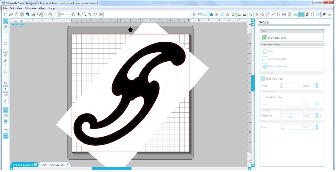
Silhouette software screen shot of the motif skewed to fit into the standard 12"x12" space.

Another issue I ran into was that you're supposed to be able to cut vinyl without a mat, but my experience was that the vinyl shifted under the rollers when feeding into the machine.   I decided to stick the vinyl on a mat to move ahead with the project.   It cut very nicely adhered to the mat.   The maximum size limit on the Silhouette Cameo is supposed to be 12" x 10' cutting without a mat.   The manual recommends sticking to less than 40" in length due to feeding issues.  Silhouette sells a roll feeder accessory to assist with rolled materials and keeping the material aligned.  However, testing the maximum length was not today's exercise.

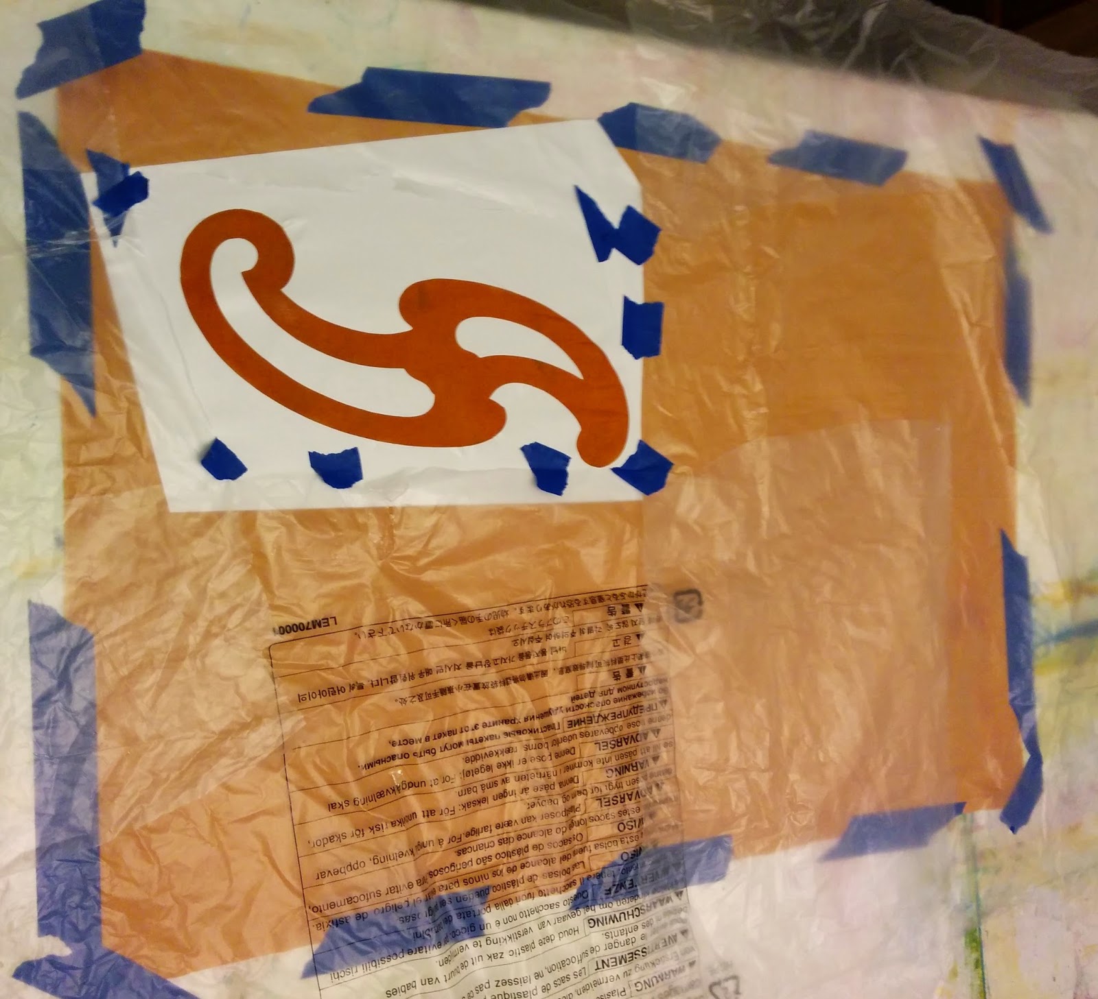
To print the stencil, I folded the fabric in quarters and ironed the folds to provide me with guidelines.  Two of the stencil edges were cut to align with the ironed folds.  I taped the test fabric down to my table, adhered the stencil and masked the rests of the fabric off with large pieces of plastic.  I applied deColourant Mist to discharge the dye.  I had deColourant on hand...   I wanted to try it...  Sadly, my light misting touch turned into more of a soaking seeping under the stencil material.  I could have chosen to wash out the deColourant product without discharging, but I decided to follow thru on my test.   I had blotted up excess mist that landed on the vinyl hoping to stop any leakage.  No luck.  I moved the stencil and made another attempt at a lighter coating.   deColourant still snuck under the stencil.   Hmmm...not the right product for this job.
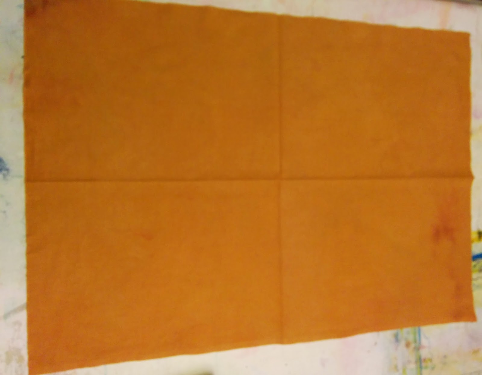
Fabric folded in quarters and ironed along folds to form guidelines.

Fabric taped to printing surface and stencil adhered.

Fabric masked with recycled plastic sheeting and spritzed with deColourant Mist 
Clearly, I need to use a thicker discharge product that I can control better.  Dishwasher gel detergents with bleach, Thiox in print paste and deColourant cream would likely all be better choices.  To control the coverage, I plan to adhere the stencil to a print screen.  I'll use a squeegee to print the discharge paste on in a fine layer to help control leakage.   I wanted to use the stencil to do mirror images.  Adhering the stencil to the front versus the back of the print screen will accomplish this goal.   Initially, I was planning to use a temporary adhesive spray to flip the stencil over and get a mirror image, but that's more work and mess.   The vinyl isn't cheap, so I didn't want to cut a second stencil if I could get away with reusing the first.  Here are the blurry results below...   Tomorrow I will try discharging with Thiox with the stencil on a screen printing frame.


In the meantime, I have a wonderful book called "Steal Like An Artist - 10 Things Nobody Told You About Being Creative" by Austin Kleon.  It's a fun read with excellent advice and lots of encouragement.  It pairs well with tea and chocolate for a boost...

The author really nailed it for me on page 83 with a funky chart entitled "The Life of a Project."   From a retired software engineer's perspective it was hilarious!   The gist of the chart is that you go through stages of initial elation, anguish as the project doesn't measure up, wrestling it back from the depths of failure (I think that's "responding" in artspeak) and finally spitting out a decent product.   I took the lesson from this chart not to give up too soon.   I'm practicing another sage bit of advice from Mr. Kleon's book - I'm going to fake it 'til I make it as an artist!