Sunday, March 29, 2015

Discharging with a Stencil + The Life of a Project

Look at this wonderful wooden French curve from the Sandy Spring Museum collection.  It was my top choice of shape to represent Christopher Alexander's concept of positive space.
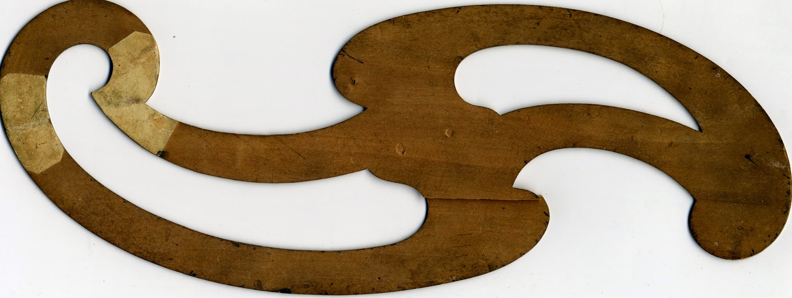
Wooden Template/French curve - Object ID 1990 0024 0022

I plan to use it as a large scale motif in the background of the fabric design enlarging the motif from 9.5" to 14" to better fit my fabric dimensions.   I'm envisioning 4 motifs placed as shown below.  This arrangement creates new shapes.   Each motif is a "center" in Christopher Alexander's terminology, but the grouping of the motifs builds additional centers which reference each other.
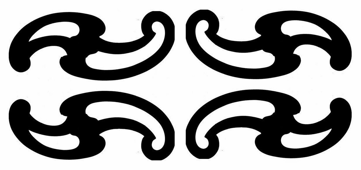
French curve motif mirrored, grouped and flipped.
I'm using Silhouette brand matte adhesive vinyl cut by a Silhouette Cameo to create the stencil.  The Silhouette software allowed me to enlarge the motif from it's original 9.5" wide to 14" wide to better fit my standard fabric size for the grant (18.5"x30").    It's a large, awkward stencil using the thin vinyl, so it's been adhered to my kitchen wall in between usages for fear of it sticking to itself.   In retrospect, a firmer stencil material would have been a better choice for this large motif.   I adhered it 4 times to fabric in my testing without issues.   It's still tacky enough to use again.   The thin diameter of the vinyl makes it easy to print.  I'll keep looking for a better, cheaper stencil material, but this work pretty well.  
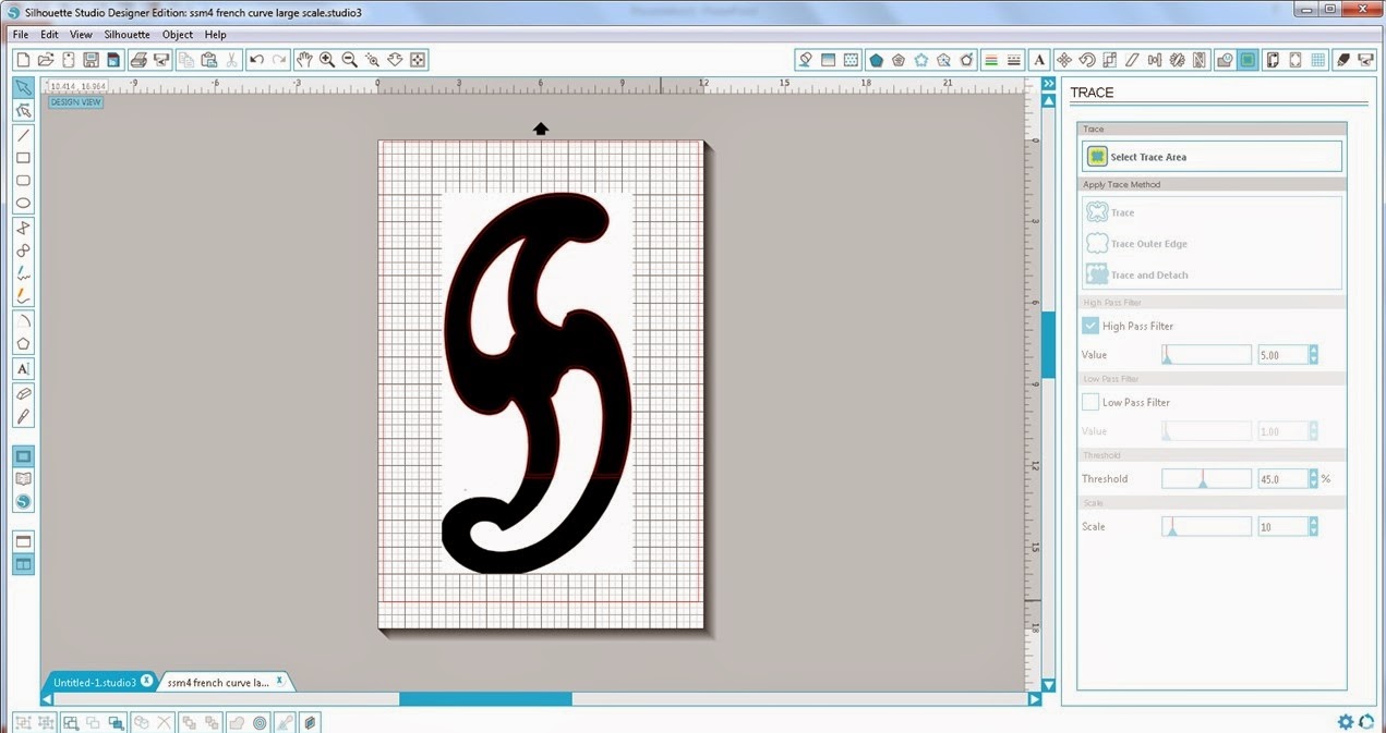
Screen shot of the Silhouette software.   The original attempt to trace the motif on a 12"x 18" background.


I couldn't get the Silhouette software to trace the 14" shape even though I had defined a large enough page space for it.   The software would only trace the upper portion that was sitting in the standard 12" x 12" grid.   So, I set the shape on the diagonal to squeeze it into the 12"x12" space.   Tracing worked great.   I'll have to figure out if the limitation lays with the software or if I have more to learn.  My mother was fond of the expression "If there is a will, there is a way."
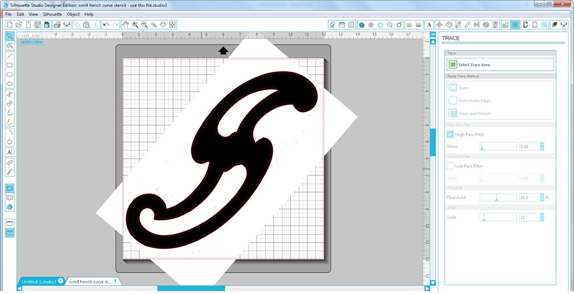
Silhouette software screen shot of the motif skewed to fit into the standard 12"x12" space.

Another issue I ran into was that you're supposed to be able to cut vinyl without a mat, but my experience was that the vinyl shifted under the rollers when feeding into the machine.   I decided to stick the vinyl on a mat to move ahead with the project.   It cut very nicely adhered to the mat.   The maximum size limit on the Silhouette Cameo is supposed to be 12" x 10' cutting without a mat.   The manual recommends sticking to less than 40" in length due to feeding issues.  Silhouette sells a roll feeder accessory to assist with rolled materials and keeping the material aligned.  However, testing the maximum length was not today's exercise.

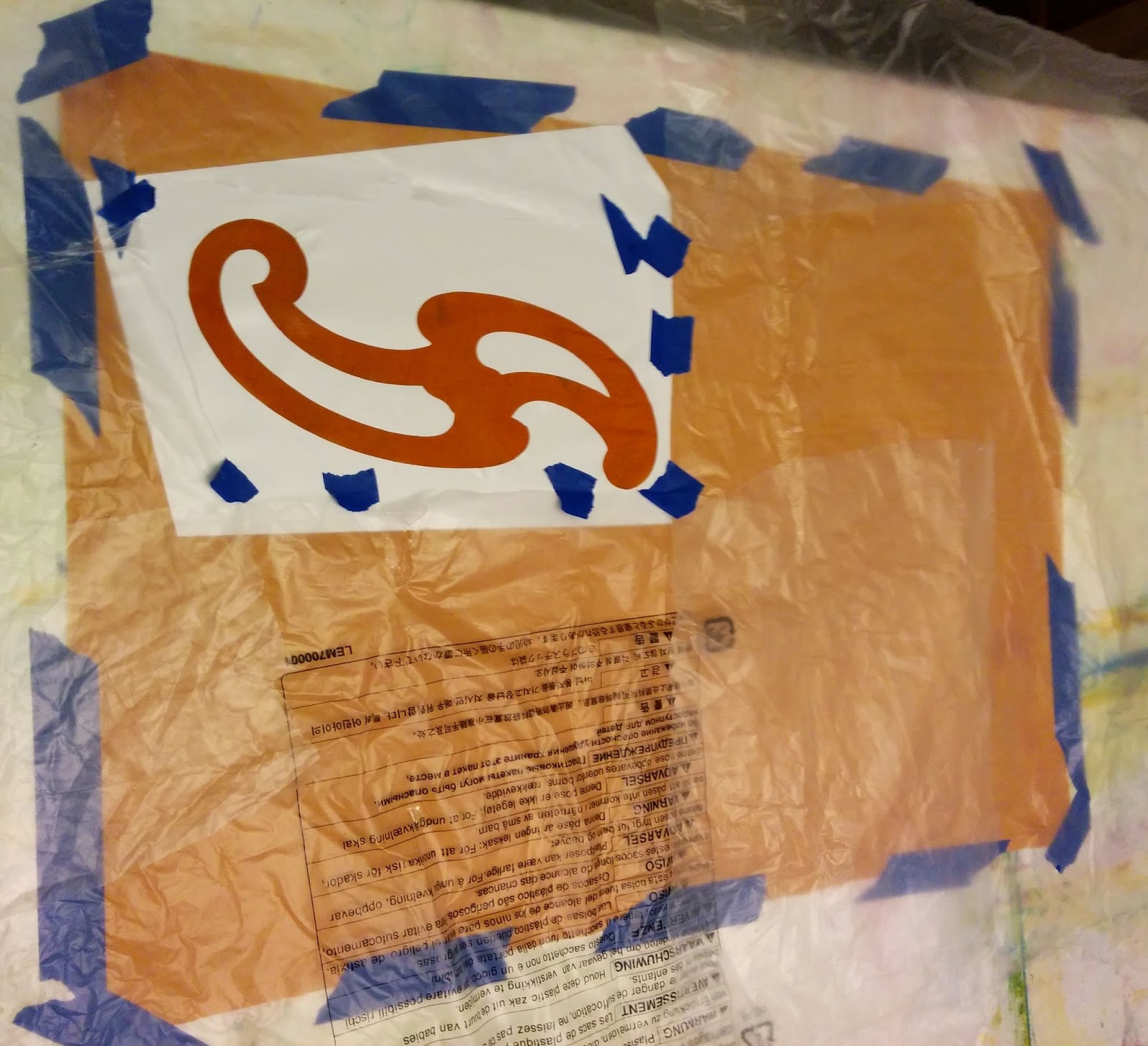
To print the stencil, I folded the fabric in quarters and ironed the folds to provide me with guidelines.  Two of the stencil edges were cut to align with the ironed folds.  I taped the test fabric down to my table, adhered the stencil and masked the rests of the fabric off with large pieces of plastic.  I applied deColourant Mist to discharge the dye.  I had deColourant on hand...   I wanted to try it...  Sadly, my light misting touch turned into more of a soaking seeping under the stencil material.  I could have chosen to wash out the deColourant product without discharging, but I decided to follow thru on my test.   I had blotted up excess mist that landed on the vinyl hoping to stop any leakage.  No luck.  I moved the stencil and made another attempt at a lighter coating.   deColourant still snuck under the stencil.   Hmmm...not the right product for this job.
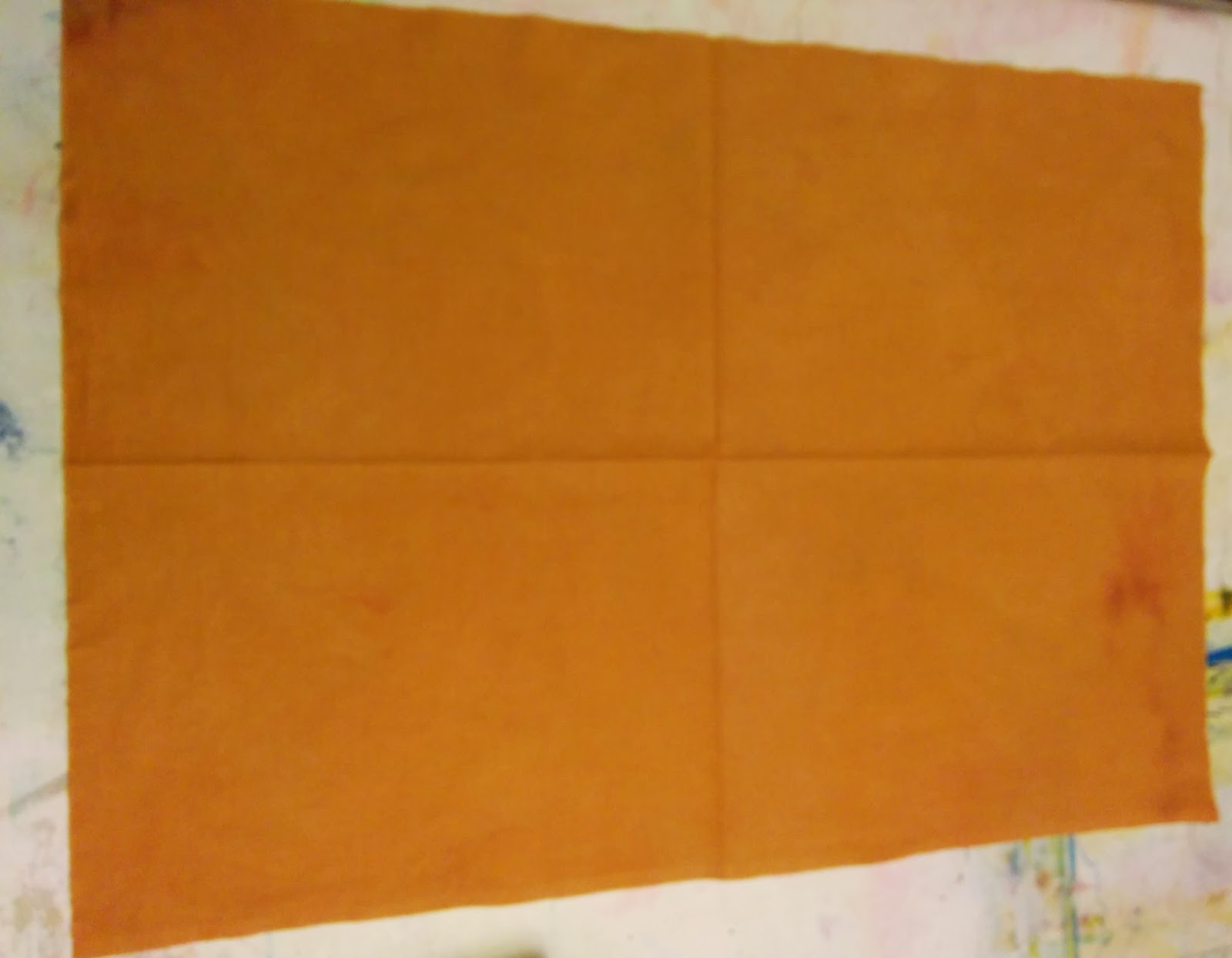
Fabric folded in quarters and ironed along folds to form guidelines.

Fabric taped to printing surface and stencil adhered.

Fabric masked with recycled plastic sheeting and spritzed with deColourant Mist 
Clearly, I need to use a thicker discharge product that I can control better.  Dishwasher gel detergents with bleach, Thiox in print paste and deColourant cream would likely all be better choices.  To control the coverage, I plan to adhere the stencil to a print screen.  I'll use a squeegee to print the discharge paste on in a fine layer to help control leakage.   I wanted to use the stencil to do mirror images.  Adhering the stencil to the front versus the back of the print screen will accomplish this goal.   Initially, I was planning to use a temporary adhesive spray to flip the stencil over and get a mirror image, but that's more work and mess.   The vinyl isn't cheap, so I didn't want to cut a second stencil if I could get away with reusing the first.  Here are the blurry results below...   Tomorrow I will try discharging with Thiox with the stencil on a screen printing frame.


In the meantime, I have a wonderful book called "Steal Like An Artist - 10 Things Nobody Told You About Being Creative" by Austin Kleon.  It's a fun read with excellent advice and lots of encouragement.  It pairs well with tea and chocolate for a boost...

The author really nailed it for me on page 83 with a funky chart entitled "The Life of a Project."   From a retired software engineer's perspective it was hilarious!   The gist of the chart is that you go through stages of initial elation, anguish as the project doesn't measure up, wrestling it back from the depths of failure (I think that's "responding" in artspeak) and finally spitting out a decent product.   I took the lesson from this chart not to give up too soon.   I'm practicing another sage bit of advice from Mr. Kleon's book - I'm going to fake it 'til I make it as an artist!

Thursday, March 26, 2015

Silhouette Cameo Die Cutter Tip

Here's a tip for die cutting fiber artists out there.   I found myself switching back and forth between the regular and fabric blades.  I was making trial cuts from cardstock, then committing to fabric cutting.   I got annoyed with searching for the blades and the little grey plastic wrench that helps you set blade depth.   So, I taped half of a chopstick to the side of the Silhouette where the blade assembly rests (left side).   It's as close as possible to the blade assembly without blocking the lid.   Customized!


Silhouette Cameo for Fabric Cutting and Stencil Making

One of the bonuses that I got from the Pro Chemical and Dye workshops this Fall was learning about the Silhouette Cameo die cutting machine.   Two of my fellow students brought fat folders of custom made stencils to use in class.   They generously demonstrated the Silhouette software over lunch one day.   It seemed easy to use.   Cyndi M. showed off the intricate small fabric pieces she was cutting for a quilt kit she'd designed.   Cutting fabric?  Cool!   One of the goals of this grant is to create my own art lexicon and generate tools.   I knew I wanted a Silhouette Cameo...and JoAnn Fabrics delivered in December.

I had a quilt challenge based on a heart quote due in February.   Cutting text for the quote sounded like a good job for the Silhouette.  I tried a test piece first with these goals:

   - cut plain cotton broadcloth plain
   - cut painted cotton broadcloth (Setacolor transparent and opaque fabric paints)
   - cut painted cotton broadcloth (ProFab textile paint and ProBrite metallic textile paint)
   - cut the above fabrics with Mistyfuse fusible webbing already applied
   - cut in reverse with the paint side next to the mat and the Mistyfuse applied to the top
Test piece
The results look messy, but were informative!   I discovered that the painted fabrics cut better than unpainted fabrics.  There were still occasional places on the bias in curvy letters where the cuts weren't complete.  The occasional small snip of the scissor was necessary.   I attribute this to the fact that the blade moves in a grid pattern - north/south and east/west.  The blade doesn't curve.   For the price of the Silhouette, I'm going to live with it!   The brand of fabric paint didn't seem to make a difference.  Mistyfuse on top or bottom cut equally well.   I had layered two thicknesses of Mistyfuse on my fabric because the letters were small.  They fused nicely to the quilt top.  I wasn't sure if the mat adhesive would grip the Mistyfuse and detach it, but no worries!   The tackiness of the mat was perfect.

On the left is the cardstock letter audition, on the left is the fabric version.
Onto the lettering results... Unsurprisingly,  I found that the tall skinny letters in thin fabric want to bias as you peel them off the cutting mat.  I quickly selected a more robust font...   Research done, I was ready to move forward cutting cardstock letters for a test layout on my busy background fabric.  The pale yellow paper didn't look very good on the fabric, but I got the letter positioning sorted out thanks to the audition.   I mixed a higher chroma yellowish green paint to help stiffen the broadcloth fabric.   My background fabric was a test piece from a soy wax dyeing exercise that had been kicking around my studio.  The slashes of purple on the bottom were very distracting.   Used the lettering to deemphasize the purple.  I think it worked.

12"x12" heart quilt challenge for the PMPatchwork Guild


Next, I wanted to create a stencil.  I used a graphics program to create a crescent shape, then put three of these shapes together into a ball.  I imported this graphic file into the Silhouette software, made multiple copies of the ball and created the cutting file.  My first attempt was cut in cardstock.   You can see it in the upper right hand side of the test piece photo above.   The crescent balls were too big and sparsely set for my taste.  I changed the scale and crammed in more motifs.   I adhered a piece of inkjet transparency plastic onto the cutting mat and guessed a blade depth of 3 based on the Silhouette's suggestions for other materials.  I guessed wrong.   I have the cuts thru the mat to prove it...ooops...   Happily, I was watching the die cutter (mesmerized by the new toy...) and stopped it quickly.   I ended up with a stencil that pleases me:-)


Sunday, January 11, 2015

Fun Finds! Comparing Crazy Quilts at Sandy Spring Museum


The Sandy Spring Museum has some wonderful crazy quilts in their collection.   I was struck by the difference between two quilts - one created in 1870 and the other, I suspect, in the 1920-1930s.  I based my guess on the art deco embroidery stitch style and the fact that some of the fabrics are old enough to have deteriorated..  Wikipedia states that crazy quilting became popular in the late 1800s "likely due to the English embroidery and Japanese art that was displayed at the Philadelphia Centennial Exposition."   Who knew? Thanks Wikipedia!
Quilt #1 - Crazy quilt made in 1870 by Elizabeth Trundle and Margaret Chiswell 
Quilt #2 - Crazy quilt donated to the Sandy Spring Museum by Lewis Moore & FLorence Grosso  (1920-1930?)
The 1870s quilt (Quilt #1) does show the satin stitching and heavy embellishment on seams and patches mentioned in the Wikipedia article on crazy quilts.  The move away from "boring" cotton to richer fabrics such as velvet and silk is typical.   The lack of lumpiness in the construction suggests that the patches were minimally overlapped.  The theme of embroidered flowers, berries and animals is beautifully unified by the same embroidery stitch in gold & white thread throughout the quilt.  A few of the patches are even painted velvet.  This quilt has a Victorian feel to it.
Quilt #1 detail - Note the unifying embroidery at the seams
Quilt #1 detail - Painted sunflower on velvet


The Brooklyn Museum had some interesting insight into crazy quilting too stating that "[crazy quilts]...were made possible by newly affordable luxury fabrics produced by the growing textile industry and encouraged by women's magazines dismissive of "old-fashioned", "dreary" cotton patchwork.  That's amusing to me as organic fibers are all the rage in America today.   Fabulous cotton fabrics in a bewildering array of solids, batiks, prints and so much more overflow my wonderful local candy quilting shops.  Quilts these days are only dreary if that's the feeling they are trying to impart!

Let's look at the art deco influenced quilt (Quilt #2).   This quilt feels more utilitarian.   It is less planned and more free form in construction and embellishment.  The maker must have had a basketful of strips - the design is more linear than the 1870s quilt..  There is less luxury/patterned fabric being used.  The maker offsets this by embroidering over whole patches.   It's hard to tell from the photos, but there are big lumpy overlaps in the construction.  The maker of this quilt focused their creative energies on an abundance of art deco inspired stitch patterns in many colors.   I wonder if it was a sampler inspired by yet another woman's magazine tracking the trends?   Whoever made this quilt, they had fun with it!
Quilt #2 detail - Many thread colors and stitch patterns are used.  Three patches above are covered in stitching.
Quilt #2 detail - more embroidery stitches and colors.  
Some of the embroidery stitches are similar to the stitch used on the 1870s quilt seams.
Quilt #2 detail - more embroidery stitches and colors because I couldn't bring myself to edit them out...   The same patterns are scaled up and down in size and variations of stitches are used to add interest.
Quilt #2 detail - the green stitch above was tantalizingly situated on the fold of the fabric, but I could tell that the motif was being reversed 180 degrees each time it was stitched 
Quilt #2 detail - here is another instance of the green stitching where all of the motifs are in the same orientation.   Sadly, you can see some of the disintegrating fabric.
Quilt #2 detail - my favorite stitch pattern!  The way the maker used two partial "trees" to fit the design into the available space speaks to Christopher Alexander's property of roughness that I talk about here in my blog.

The Sandy Spring Museum collection also contains a set of 1930's electric bills with advertisements on the back designed to sell more electricity.   I enjoyed reading about the latest and greatest appliances and services.   I want to use the crazy quilt format as inspiration to integrate the advertisements into a surface design piece.   It will give me the opportunity to have fun with the art deco inspired stitches too!   Are you thirsty after reading all of this?  Maybe you should get a chilled drink out of the refrigerator models below!
1930s Advertisement on the back of a Potomac Electric Power Company bill

Sunday, December 28, 2014

Strong Centers, Boundaries and Contrast

Strong Centers, Boundaries and Contrast are three of the Fifteen Properties of Wholeness defined by Christopher Alexander in his book "The Nature of Order: An Essay on the Art of Building and the Nature of the Universe, Book 1 - The Phenomenon of Life."    These postcard sized embroidered collages are my attempt to grasp each principle.
Strong Centers - Good Example
Strong Centers - Bad Example
After reading about Strong Centers, I created the piece on the left.   It started out alright with some tidy circles and lines, but took a sharp turn down ugly lane.  The piece displeased me - the lines are messy, the embroidery doesn't seem to relate to the collage below and the dead center placement leaves that bullseye floating awkwardly alone.  If you've read some of my previous posts, you'll know that I've given myself permission to risk making ugly art in my explorations.   (I just don't plan to post most of it...)   I decided not to attempt to fix this piece.   Once you've pierced the card stock collage, you're stuck with a hole.  I cut extra collage paper blanks for this eventuality.  On the right is a piece I consider to be much more successful.   Besides  pleasing me aesthetically, it demonstrates the principle of Strong Centers more fully.

My design group of 6 fiber artists has decided to study one of Christopher Alexander's principles each month.   Happily, we discussed Strong Centers in November.  We brought examples of the principle we're studying to kick start the discussion.  Some examples were challenges.   Does the example have a center(s)?  What constitutes a center?   What makes a center strong or weak?   We had a lot of opinions.  We dug back into the source book.   My understanding of Strong Centers was too limited upon my first reading.   Group discussion broadened my thinking.   The piece of the left is just a bullseye sitting in the middle of open space.   Yikes!  This did not result in beauty or wholeness to my eyes.   The idea that multiple supporting centers can strengthen a design and build to a strong center made the piece on the right much more successful.   I used 4 small orange circles in the corners bisected by a partial frame and additional circles around the small black circle to achieve a Strong Center.   I purposefully did not center the design on the postcard sized paper to remind myself that's not necessarily the kind of "centering" we're seeking.   I can identify several more principles in this design - Roughness, Levels of Scale and Contrast.  I suspect this design also qualifies for Positive Space and Echoes.   I'm looking forward to revisiting these pieces as I learn about each principle to see how many of the properties I've used unwittingly.

Boundaries
Boundaries was a fairly concrete concept after dealing with Strong Centers.  I've always liked designs with strata and clear delineations.   We'll see if my understanding needs adjusting when the design group reaches boundaries!   This design is a thick frame around a center area.

Contrast
Contrast was another concept that came to our design group easily.  We were used to thinking of color contrast, but were able to broaden our thinking to find many other kinds of contrast.  We brought more examples than we had time to review.   Contrast is everywhere!   We had good discussions on the necessary degree of contrast for effectiveness.   We pondered contrast in themes - summer/winter, apples/oranges, wet/dry, dogs/cats, rain/sunshine, male/female, etc...   It was fun to play with contrast in the piece above::

  • light and dark
  • odd and even
  • shiny and matt (hard to discern in the photo!)
  • open and closed shapes
  • thick and thin (1/3 to 2/3 proportions taken up by shapes)
  • overlapping versus non-overlapping shapes
  • filled versus unfilled shapes

If you've read this far, you'll know I'm way over my word count goal:-)  I'll just finish by saying how valuable it is to view design from a new viewpoint.   It's interesting to contrast the traditional elements and principles of design with Christopher Alexander's vision.

Tuesday, November 18, 2014

New Color Mixing for Dyers - Tool Acquisition - Hello Turquoise!

One goal of my grant is to acquire the tools of a working artist.   Here's a glimpse of the color reference notebook I made last week in Color Mixing for Dyers Part 1 with Carol Soderlund at PRO Chemical & Dye    This close to Halloween (O.K., I admit to procrastinating on putting out this post...) I can definitely say it's a resource of monster proportions.   

This sample book of Procion MX Reaction dyes includes 3 different color families created from different combinations of yellow/red/blue pure dyes.  We dyed over a 1000 color swatches in the workshop!

Each team of dyers was assigned a pure yellow, red and blue dye to combine to create a unique color family along with some fun side assignments.  The process went a long way to increasing my understanding of Procion MX Reactions Dyes.   One of the families used Deep Navy as it's blue component.   I picked Deep Navy as my blue for the grant as I liked the deep shades it could dye.   However, it turns out to be a bully...a little Deep Navy goes a long way!   It's a bit limiting too...and my head was turned by the lighter, brighter blues used by the other 2 groups.   So pretty, so tempting, so much more available range in brighter colors... Carol suggested that I add a "cousin" to my dye family of Tangerine, Strongest Red and Deep Navy.   Hello Turquoise!   Welcome to the the extended family of color happiness...

Turquoise dyed at  different strengths

Nature always wears the colors of the spirit.  - Ralph Waldo Emerson


Tuesday, October 21, 2014

All About Image Transfers with Jane Davila - My Favorites

The Potomac Fiber Arts Guild hosts speakers at our monthly guild meetings.  This month it was Jane Davila who gave a great talk on the elements of design.   I was only in town for one of her workshops, but happily "All about Image Transfers" was the most useful for my grant work.   Here's the class description:   

  "Learn direct and indirect transfer methods to add images to your projects. Transfer Artist Paper (TAP), acrylic paint, solvent and medium transfers, plus direct printing on a variety of fabrics, will be covered. Students transfer images from their own photos."

I used the B&W and color images below taken from the Sandy Spring Museum archives as my test samples.
Illustration from "Indians of Early Maryland" by Harold Manakee (not sweating copyright issues because the sketch was created in the 1600's and reprinted by Mr. Manakee)

Homeopathic medicine kit bottles

We used Transfer Artist Paper (TAP) in class.  The directions were simple.   I goofed on my first TAP transfer anyway...   Being impatient, I peeked after a bit of ironing, then continued to iron.   I pulled the TAP off half way, but got distracted talking to a friend.   The TAP cooled down and didn't transfer well.   I tried again *following the directions* with excellent results.   This process was more involved than directly printing an image on prepared fabric sheets, but the image can be transferred onto fabric, paper, wood, glass, canvas, metal and more according to packaging making it more versatile process.  I think that this will be the easiest transfer process to integrate into my work.   I'm looking forward to spending time with TAP!   I hope I remember to reverse the images before printing them as this indirect method produces a mirror image.
TAP test - Top left photo of fabric is first attempt with timing issues and top right is TAP paper after transfer showing how much ink wasn't transferred.    Bottom left shows second attempt on fabric with the TAP paper at it's right almost completely transferred.  Only a shadow of ink remains untransferred.  


Direct printing onto Jacquard Inkjet Fabric Sheets worked just as well as TAP.  We tried out silk and cotton.  I missed out on trying the ExtravOrganza Digital Textile sheets, but knew I had squirreled some away in my stash to test at home.   Jane Davila advised us to use an Epson printer with Durabrite ink for best results, so I've added one to my artist tool kit.   The trick will be figuring out how to integrate these fabrics as another layer of the surface design.
Jacquard Inkjet Fabric Sheets - cotton on top and silk on the bottom
The final method that I want to use is a laser toner copy and acrylic paint transfer method.  Once again, it was quick to do and the results were great.   Once again, the question is how to integrate the image as a layer in the composition.   This is an indirect transfer method, so the image printed in reverse.  I loved this method because I already have the necessary supplies at home.

Laser toner copy and acrylic paint transfer method
Image transfer techniques have come a long way since I experimented with Bubble Jet Set in early 2000.   It was great to have Jane Davila walk us through a variety of  methods showing us the various effects that we could expect.   A sample speaks a thousand words...   Some artists in the class preferred methods that gave less perfect results.  The partial transfers lend themselves to softened, mysterious and aged looking images.  I loved the processes that gave complete transfers.   I cut down on my own experimentation time dramatically thanks to Jane's tips and tricks.  I recommend the class and Jane Davila as an instructor if  you're interested in doing image transfers.